North Rebrand
Business as usual
is no business of ours.

The Retirement Challenger Brand
The retirement category is full of the design clichés you might expect; muted palettes, a quiet and reflective tone as well as lots of elderly people smiling with their grandchildren.
To create a competitive advantage, we built a brand around growth instead of decline.
Insight
Retirement might be inevitable, but growth isn’t. It requires specialist expertise coupled with adviser ambition to get right. North is storied enough to be credible, specialist enough to own retirement and innovative enough to lead it.
Strategy
In a category obsessed with features, we shifted the conversation from what North does to what North makes possible: helping adviser practices grow and creating greater potential for their clients in retirement.
Idea
‘Where Growth Happens’ became the foundation of the new identity. We looked to growth itself for inspiration, finding it in the organic geometry of growth rings: a natural record of progress over time, with no two ever the same.

Growth Rings
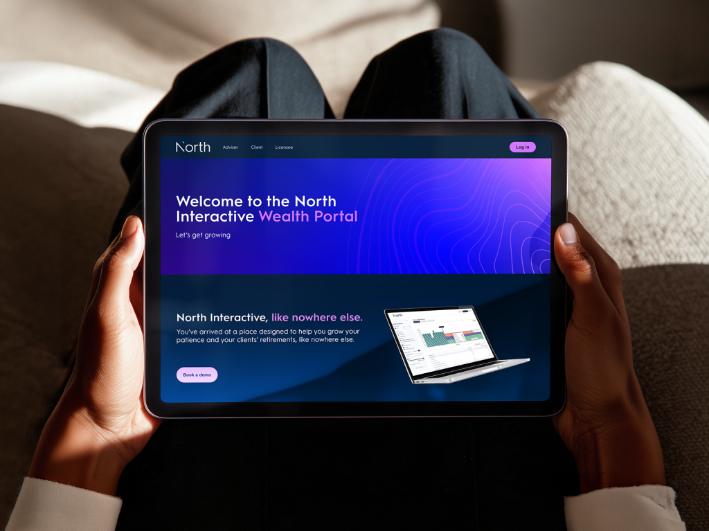
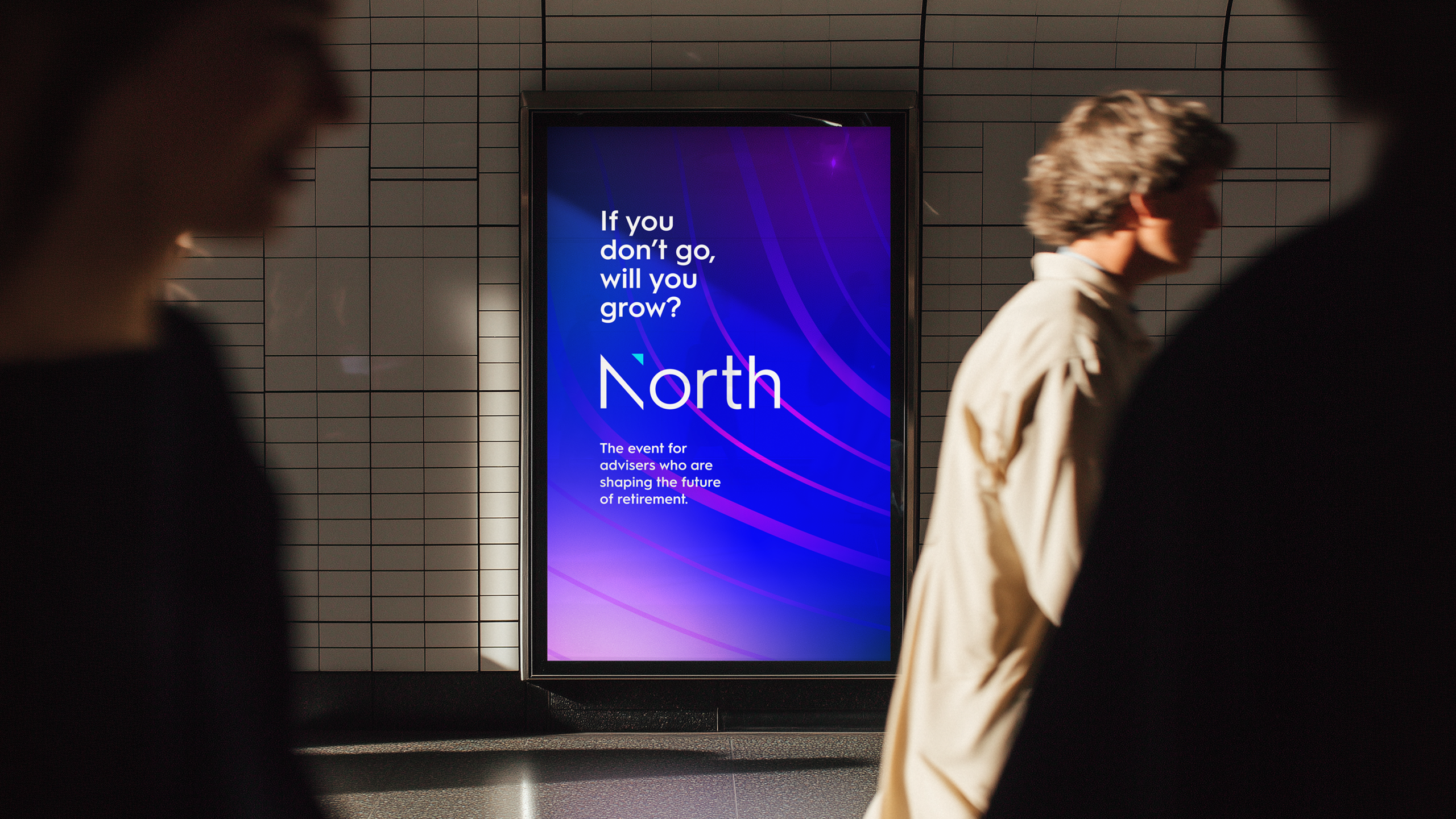
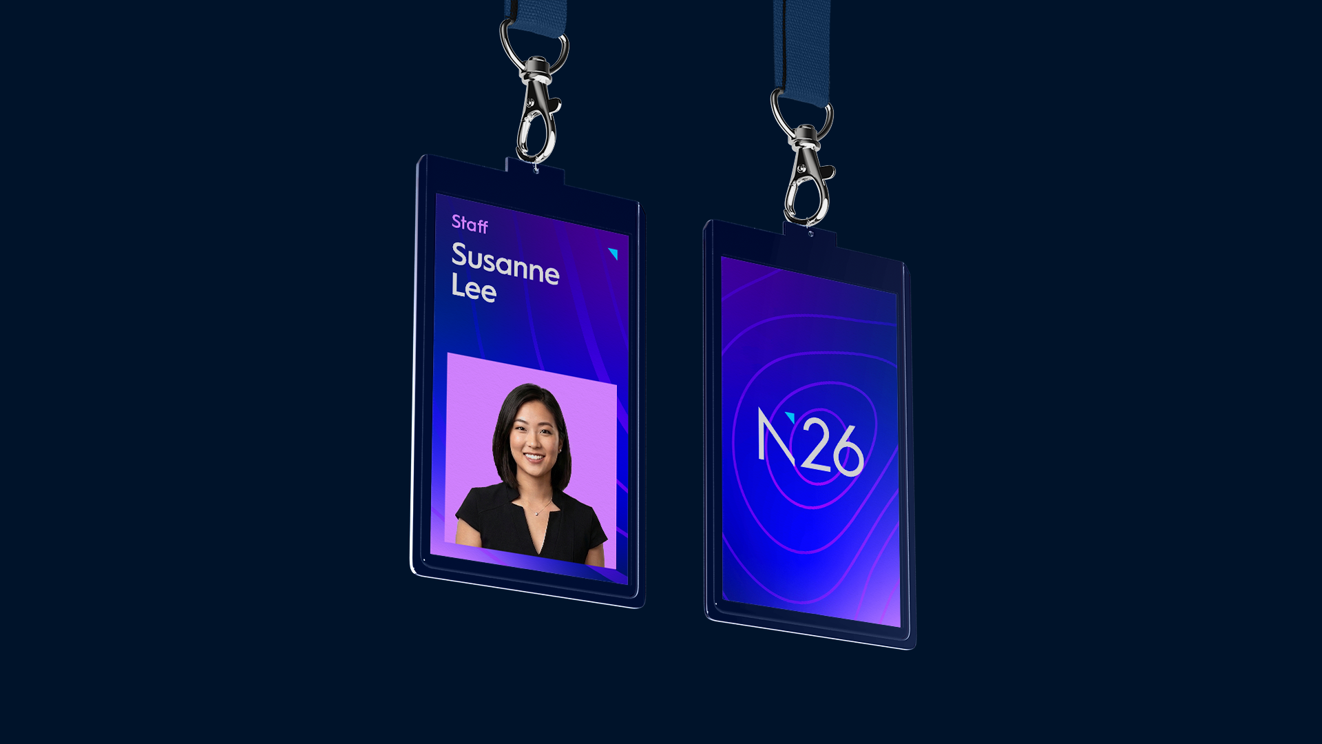
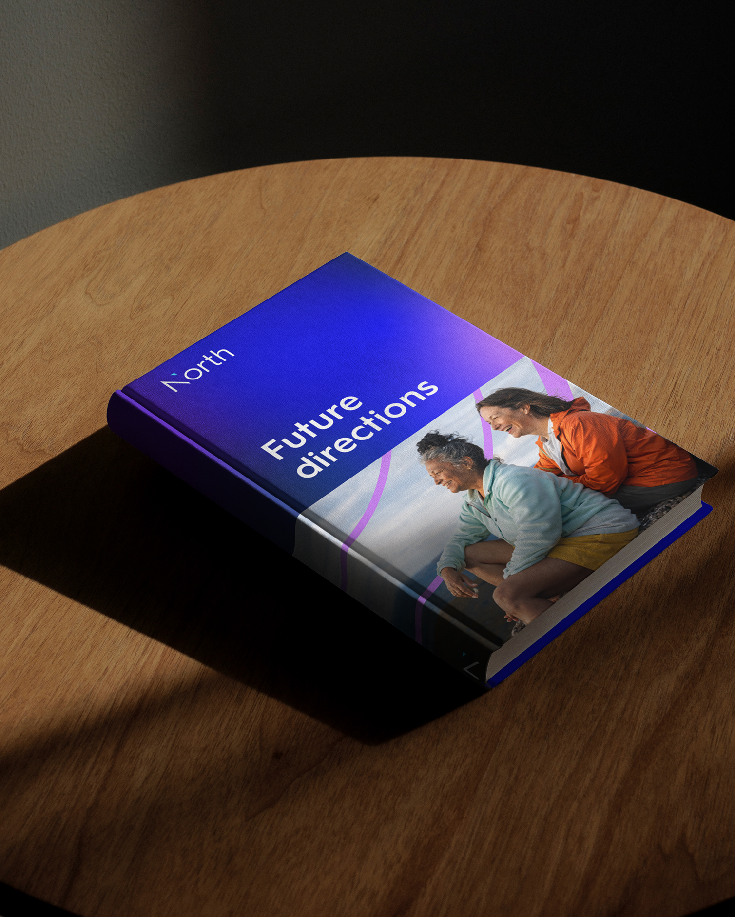
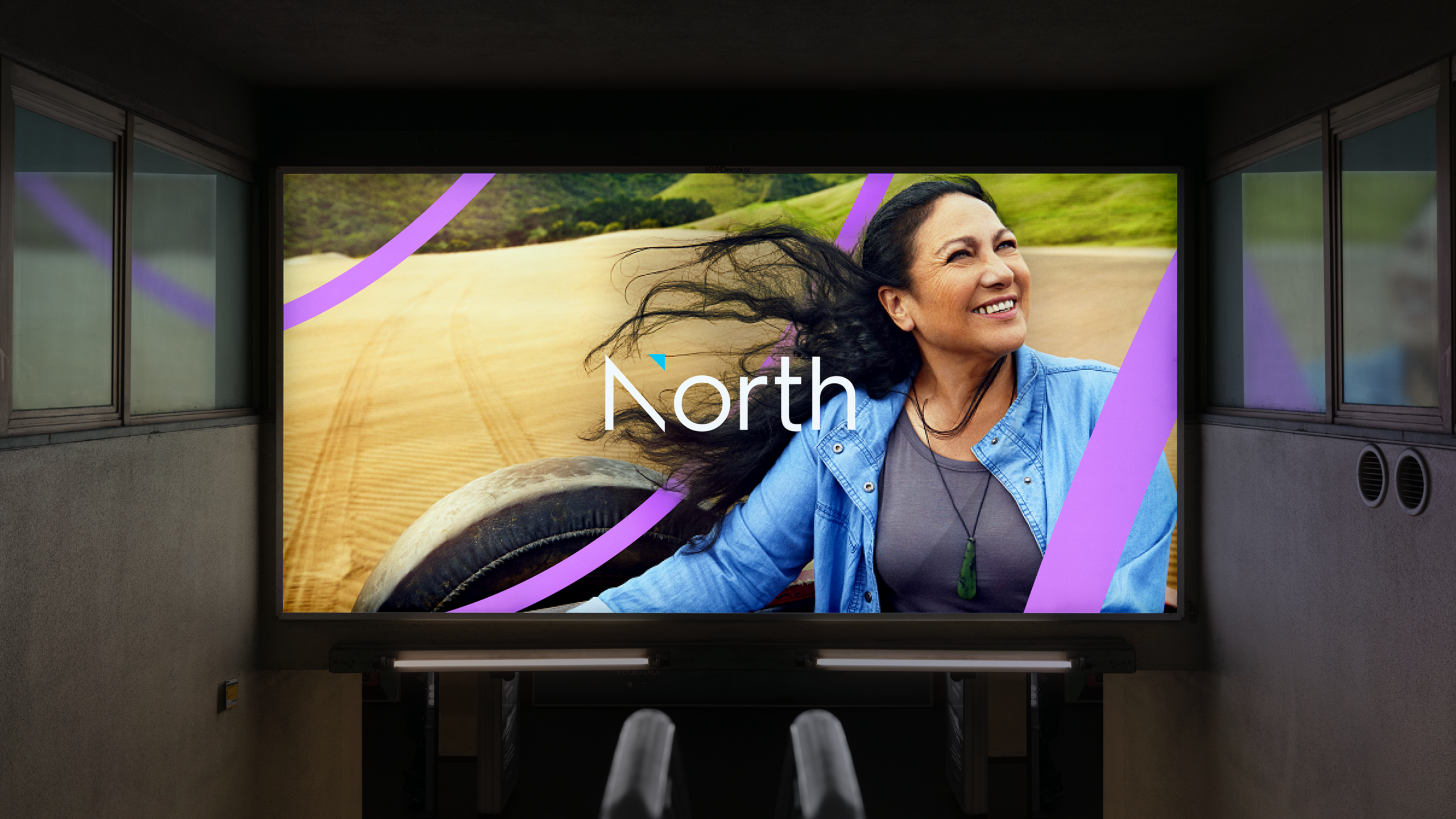
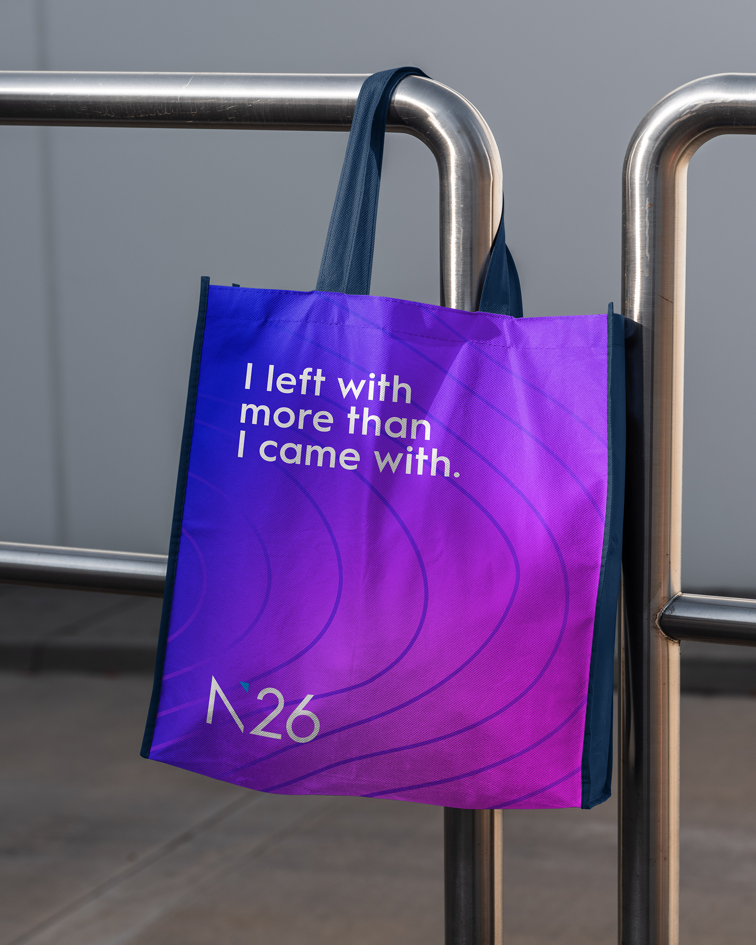
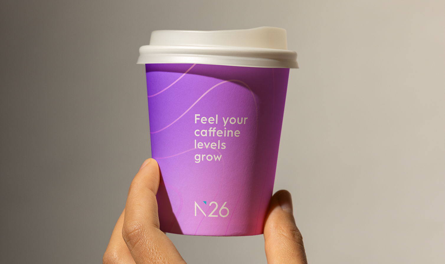
We transformed growth rings into a visual language that was fluid, individual and always evolving. The rings form the connective thread of the identity, radiating, expanding, cropping and weaving through layouts to create an expression of growth that can be different for every story while remaining unmistakably North.
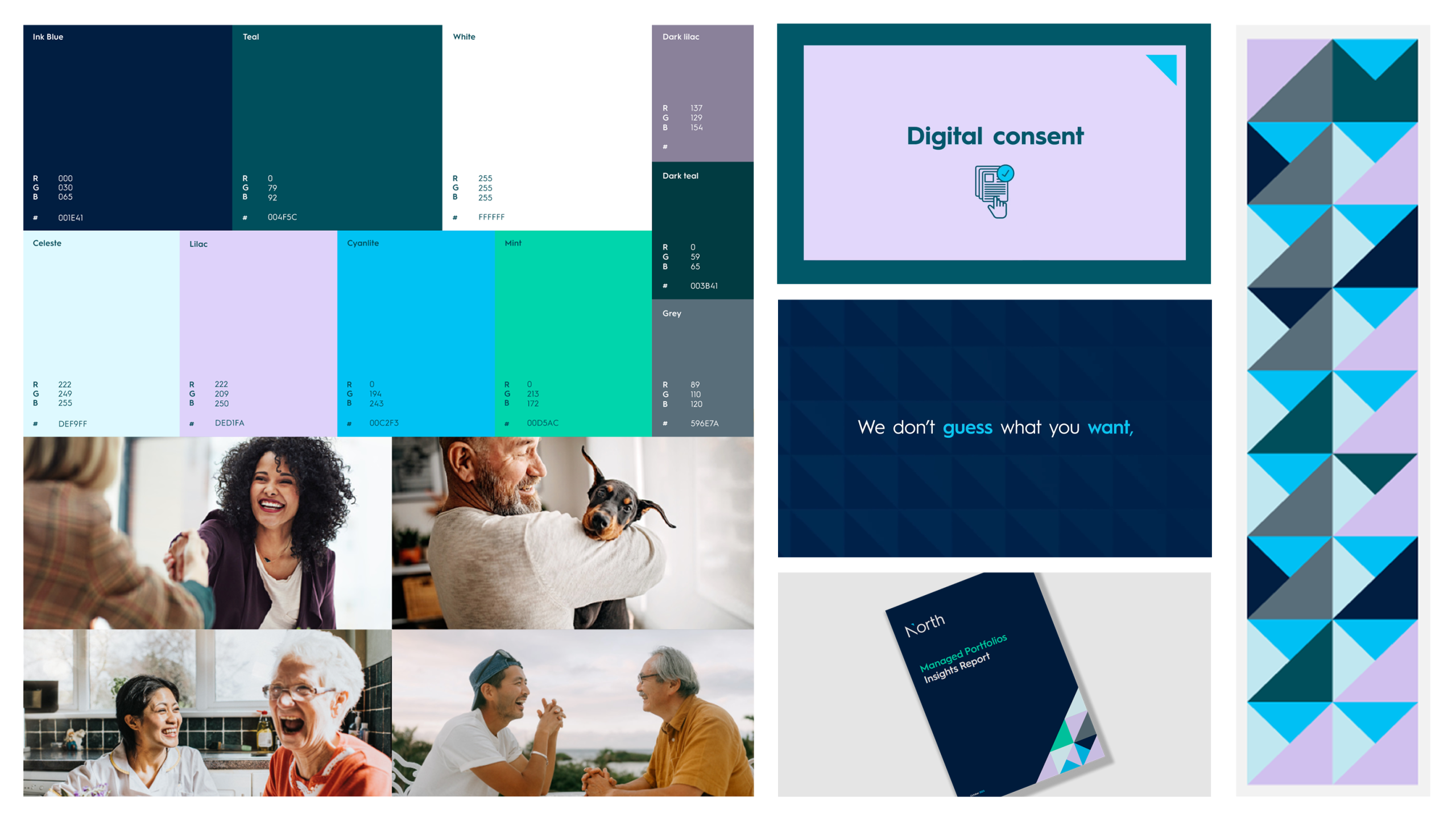
Two energetic gradient worlds give the system depth and movement, while a distinctive colour palette breaks from the corporate navy that dominates the category. Combined with bold typography, imagery and a flexible grid, the result was a design system built to continually evolve across every touchpoint.
“North understands my needs and pressures”
Melbourne North 26 attendee
“They talk a language we,
and our clients, love”Adelaide North 26 attendee
“North is hungry and
wants to be a leading
platform for advisers”Adelaide North 26 attendee
Previous Look and Feel